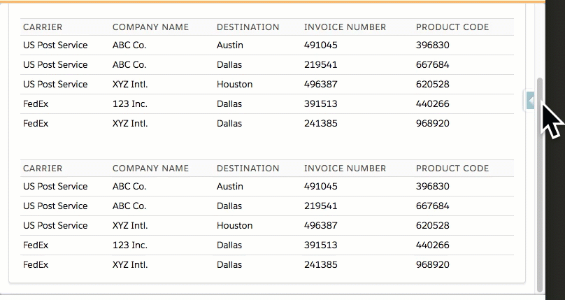
The default behavior of VisualForce tables (apex:pageBlockTable and apex:dataTable) is static – they don’t rearrange the data to better fit tablets and smartphones.
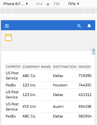
This example shows how tiny the table data can appear on an IPhone.
Sometimes the table will not decrease in size and will require the user to scroll sideways to see all data in it.
I’ve implemented a CSS solution based on principles described on this article at CSS-tricks.com and have added several adjustments to make it work requiring minimal changes to the VisualForce code.
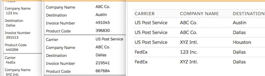
This solution below (my GitHub) resizes and rearranges the table data according to the screen size and can be implemented in 3 steps.
https://github.com/fmendes/MobileResponsiveVisualForceTable/tree/master
- use the “mobileFriendly.css” file linked above – it contains the CSS directives to make a browser respond to the screen size
- add to your apex:pageBlockTable or apex:dataTable the attribute below:
styleClass=”mobileFriendly”
- for each column in your table, add the attribute below containing the column header to display
html-data-header=”your column header text ending with a space”
You can edit the CSS file to adjust how the elements appear, increase font-size or weight, etc.
This was tested mostly with lightningStylesheets=”true” but it works in Classic too.
The result is below (animated GIF showing the table responding to screen resizing):